
Preparing artwork
Good artwork makes the booth look part of your stand, not an add-on. Use this guide to set up backdrop and print files properly before you send them through the contact page.
Start with the right artwork for the right item
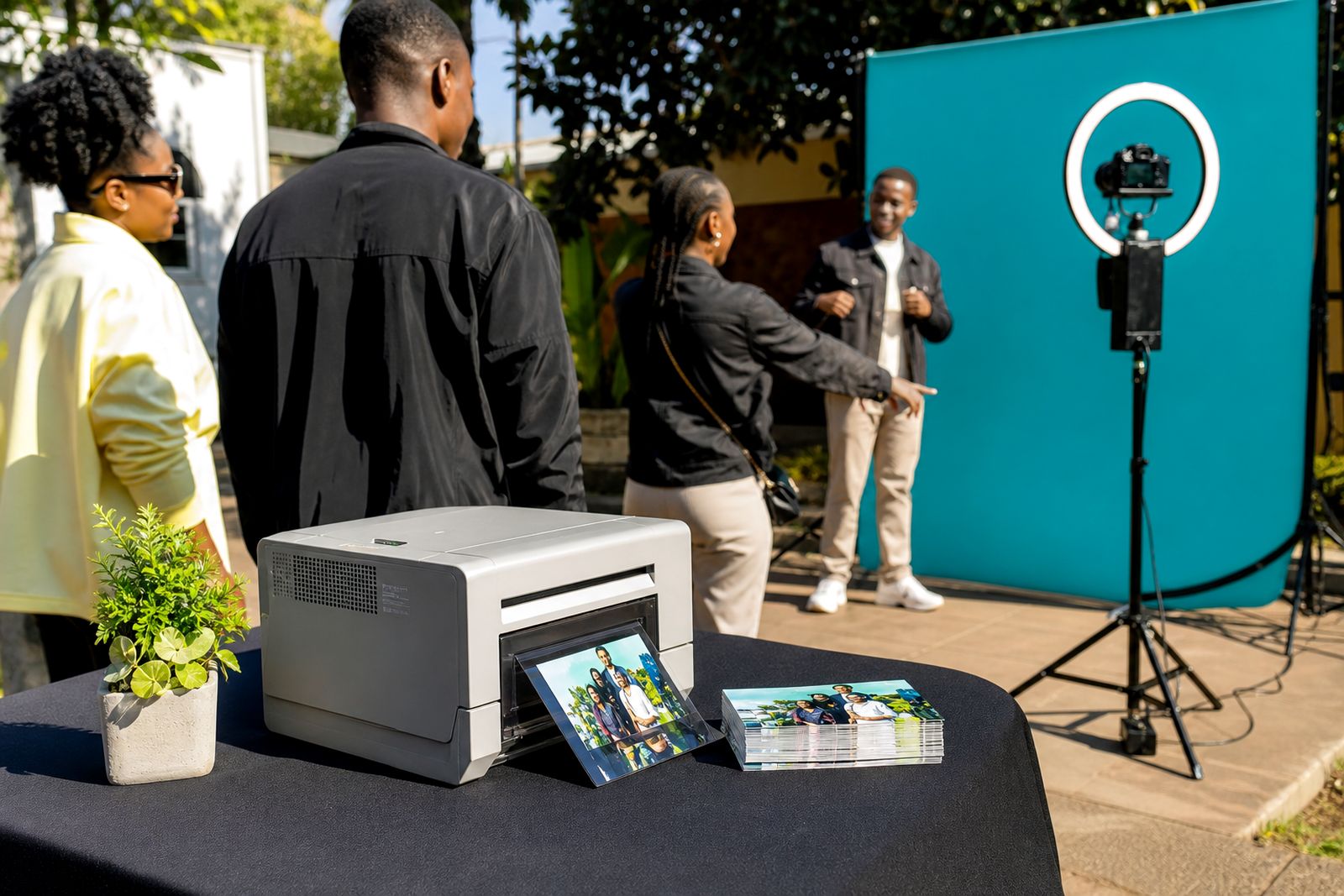
Backdrop artwork and print frame artwork do different jobs, so they should not be supplied as one combined file. The backdrop is viewed from several metres away and needs clear branding, strong contrast and simple placement. The print frame sits around a photo and needs enough breathing room so faces, hands and event details are not covered.
Before you brief your designer, confirm exactly what you have booked: an open-air booth, a 360 video platform, a print station, or a full setup with more than one branded item. Our team will tell you which assets are needed for your hire. If your stand artwork already exists, send the original working files where possible rather than a low-resolution image pulled from a slide deck.
- Backdrop file: for the freestanding visual area behind guests.
- Print frame file: for the printed photo border or branded overlay.
- Screen graphic if needed: for start screens or sharing screens where applicable.
- Logo pack: preferably vector files for clean scaling.
- Font files or outlined text: so nothing reflows at the last minute.
Set up file size, bleed and safe area correctly
The safest approach is to build artwork at the final trim size supplied for your booking, then add bleed all round. If you are not sure of the exact dimensions, ask through the enquiry form before exporting. Do not guess, because a file built to the wrong proportion can stretch logos or crop key content.
For backdrops, keep logos, taglines and QR elements well inside the safe area. Edges can be affected by stands, clips, fabric tension or slight movement during setup. For print frames, leave enough inner margin so guests' faces stay clear even if they stand a little left or right. This part is often rushed and then teh final print feels cramped.
- Add bleed on all outer edges.
- Keep important text and logos inside a clear safe area.
- Do not place fine text too close to corners.
- Use consistent proportions from artwork setup to final export.
- Check that any QR code has enough white space around it.
If your design includes a solid border, remember that small production tolerances can make one side look slightly thicker than another. A more forgiving layout usually works better than a hairline frame pushed right to the edge.
Use artwork that stays clear under event lighting
Event halls, launch spaces and function venues can be dimmer than expected, and mixed lighting can shift how colours look on camera. Artwork that seems subtle on a bright monitor may disappear in a busy expo environment. Choose strong contrast between background and logo, and avoid thin pale text on a light field.
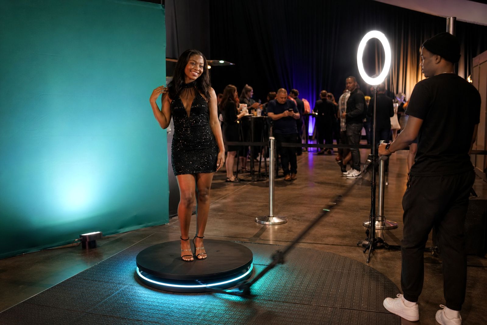
For open-air booths, guests may be photographed with flash or continuous lighting. For 360 video clips, movement matters more than fine detail, so bold shapes and clean blocks of colour work better than delicate patterns. Metallic effects, fake gradients and tiny drop shadows often do not translate well once filmed or printed.
- Use high contrast between text and background.
- Prefer larger logo placement over many small sponsor marks.
- Avoid very thin lines and very small copy.
- Keep key branding at eye level where possible.
- Test any QR code from a printed sample, not only on screen.
If your event is near the coast, humidity can affect some materials and finishes, so simple strong artwork is usually the safer choice. In Johannesburg dry conditions are easier on prints, but venue lighting still does most of the damage to weak layouts.
Prepare print frame artwork with room for the photo
A print frame should support the picture, not fight with it. Start by marking the live photo window accurately, then build your branding around that area. Leave enough top and side space so different guest heights still sit comfortably within the image. If the event has hats, product samples or raised arms, allow a bit more headroom than you think you need.
Keep event wording short. A date line, campaign line or division name can work, but long sentences become hard to read on small prints. If you want more than one print layout, tell us early so the operator can check each version before the event starts.
- Mark the photo window first.
- Keep logos out of the live image area.
- Use short text that reads quickly.
- Allow for portrait or landscape orientation only if it has been confirmed for your setup.
- Supply linked images at good resolution, not copied from messaging apps.
It also helps to print one sample at actual size in the office before sending final files. What looks balanced on a large monitor can feel crowded in hand, specially on smaller print formats.
Choose the best file format and export settings
Working files are useful if adjustments are needed, but the final approval file should be exported cleanly and checked before submission. Vector artwork is best for logos, text and line work. Raster images should be high resolution at final size. Avoid screenshots, presentation exports and artwork pasted into word processing files.
Where transparency is required for overlays, keep that transparent area clean and properly exported. Flatten effects only if you have checked that edges remain smooth. If text is not outlined, include the font files or expect a possible substitution if the typeface is unavailable.
- Preferred supply: print-ready PDF plus editable source file.
- Use CMYK for print items unless you have been told otherwise.
- Outline text or include fonts.
- Embed or package linked images.
- Name files clearly, for example backdrop-final or print-frame-approved.
Before sending, zoom in and inspect edges, logo quality and spelling. Small errors are easy to miss when everyone is rushing for setup day and the venue access window is tight.
Final approval checklist before you send files
Once artwork is signed off internally, send the final files through the enquiry form on our contact page. If there are multiple items, label each one clearly and say what it is for. Our team can then match the file to the correct booth, print station or backdrop without back-and-forth.
A good final check saves time on event day. It also helps the attendant focus on guests rather than sorting out avoidable artwork issues onsite.
- Correct dimensions confirmed for each item.
- Bleed added where needed.
- Safe area observed for text and logos.
- Spelling, spacing and punctuation checked.
- QR code tested from a printed sample if included.
- Colours checked for contrast under likely venue lighting.
- Final approved PDF included, with source file if available.
- Each file named clearly and matched to its use.
If you are unsure about any point, send what you have early rather than leaving it until the day before. Small fixes are usually simple when there is enough time, but harder when courier cut-offs and venue access rules are already in play.
What our Photo Booth Hire customers say
Verified Google reviews
Questions we get asked
Can I use the same artwork from my expo stand on the booth backdrop?
Often yes, but it usually needs resizing and simplification. Stand artwork can include details that are too small or badly placed for a photo area, so send the original file for checking first.
What if I only have a JPEG of the logo?
Send it through, but a vector file is better for clean scaling. If the only logo available is a small JPEG, quality may drop on larger backdrop applications.
How late can artwork be sent?
Send approved files as early as possible through the contact page. Last-minute changes are not always practical once production, packing and event setup are underway.
Also worth a look
Book a booth
Send a note through our contact form with the event, the venue and the kind of booth you have in mind, and our team will reply with options.
Open the contact form